Designing a logo for your company sounds like an easy job, right? According to most business owners, it’s as easy as drawing a circle around your company’s name and then calling it a done deal.
However, if your company is truly worth what your clients are paying you, then you might want to put a little more time and effort into it than that.
Today, there are thousands of logo designers who claim to be able to design you an amazing perfect logo for as little as $10 or $20. But then after paying them, all you’ve gotten is a logo that’s about as good as something drawn up by 5 year old on a napkin.
So, how do you design a serious, professional-looking logo that’s bound to draw attention? Check out for ideas online like through CityTech’s site, which provides information on what makes a good premium website. Below, we’ll go over a few simple tips to help you design the perfect logo for your brand.
Tips for Creating the Perfect Logo
Never Underestimate Colors
Many people underestimate a logo’s color, and believe that designing a plain, single color logo is just as efficient as using a whole color palette.
However, the truth is that your logo’s color palette is not a superficial decision at all. In fact, different colors carry different meanings and go a long way in helping you communicate the idea behind your brand.
In some cases, you’ll have no choice but to use the brand’s colors, however, there are times where you’ll be free to explore and experiment with different color schemes.
Regardless, make sure the colors you choose breathe life into the logo and help pull in whoever is looking at it for a better look.
Just remember that a good logo also needs to be versatile and should still look nice in black and white.With that being said, make sure to take some time to consider what your logo is going to be used for and whether it will require different versions for various uses.
Learn more about using colors effectively.
Own It
The concept of creating a logo that is “ownable” is extremely important in making sure that your logo is unique to your brand, but still helps draw in the viewer’s attention.
So, rather than using design ideas that have been done a thousand times before, it’s crucial to strive for a design that is completely unique and easily recognizable. To do this, take a few moments to think about whether your design is generic or something that is likely to be produced by others in the same industry as you.
Keep in mind that your first couple of ideas are usually going to be your most generic ideas. Therefore, we recommend filling up a page or two with a handful of rough sketch ideas before settling on a single idea to pursue.
Make Use of Negative Spaces
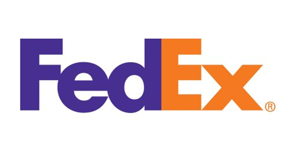
Another age-old trick that’s often used effectively in logo design is making use of the logo’s negative space. The best example of this is the FedEx logo, which looks simply like the company’s name. However, if you look closer, you’ll see that there’s an arrow hidden in the negative space between the E and the X.
Most people see this logo nearly every day and still never notice the arrow, which is what makes this simple design so effective, and yet interesting enough to capture the viewer’s attention.
Check out more famous logos that make use of negative space here: https://www.creativebloq.com/design/10-logos-make-clever-use-negative-space-61621038
Use the K.I.S.S. Principle
Let’s take a moment to face the fact that not everyone in design can throw together a beautiful, hand-drawn logo on a whim. And just because you’re working on designing a perfect logo, that doesn’t necessarily mean that you’re a good illustrator (although it’s an excellent skill to have).
Still, none of this means that you can’t design an awesome and effective logo, as long as you stick to the K.I.S.S. principle, otherwise known as Keep It Simple Stupid!
Always remember that some of the most powerful and memorable logos in business are also some of the simplest designs, which stand out from the rest, and are easily recognizable no matter where you go.
For example, think about the Apple logo, or Nike’s check mark logo. Both are extremely simple designs, but if you asked practically anyone in the world, they would instantly be able to tell you what companies they belong to.
In terms of designing a simple, yet effective logo, let’s look at the Apple logo as an example. There is really nothing special about the silhouette of an apple. So, how come this logo is so powerful and memorable?
Well, if you take a closer look, it’s the missing bite of the apple that really brings the logo up to the next level. Not only does the missing bite make the logo unique, it also adds character and meaning to the overall design.
So, with that in mind, always take time to consider how you can go one step further and turn your simple logo into a powerful and memorable design.

